
Result Charts
After a backtest completes, Jesse generates a set of charts that give you a visual breakdown of your strategy's performance from multiple angles. Each chart focuses on a different dimension of risk or return, and together they paint a much richer picture than the summary metrics table alone.
Cumulative Returns vs Benchmark
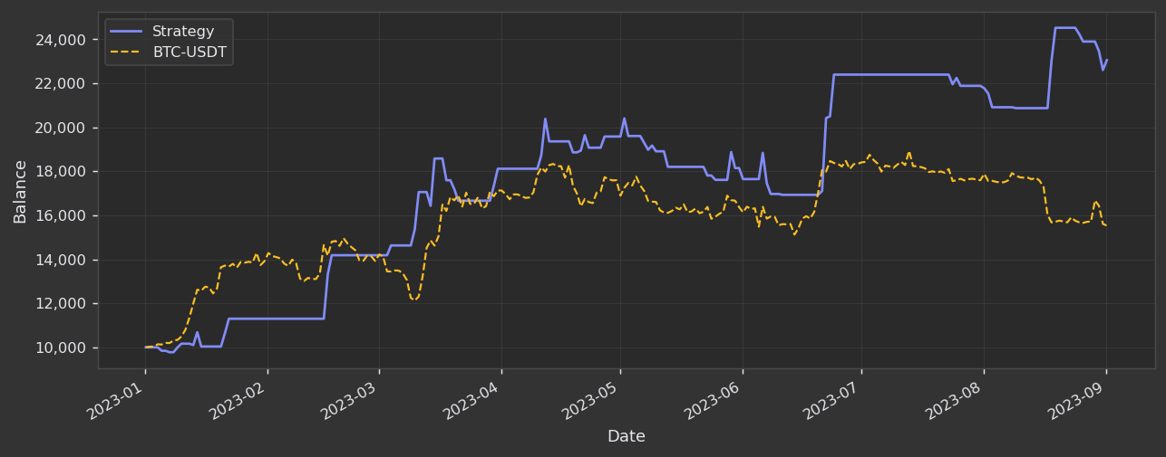
This chart plots your strategy's portfolio balance over the entire backtest period alongside a buy-and-hold benchmark of the traded symbol. Both lines start from the same initial balance so the comparison is apples-to-apples.
- Blue solid line — your strategy's equity, updated after every closed trade.
- Orange dashed line — what a passive investor who simply bought and held the same asset would have achieved over the same period.
What to look for:
- Strategy line consistently above the benchmark — your strategy is adding genuine value over simply holding the asset.
- Strategy line below the benchmark for long stretches — the strategy may be underperforming a simple hold. Combined with the drawdown charts, this is a signal to revisit your exit logic or position sizing.
- Flatness in the strategy line — periods where the curve is horizontal mean the strategy was out of the market or had no profitable trades. These are opportunity-cost periods worth investigating.
- Diverging lines near the end — a widening gap between the strategy and benchmark near the end of the period (in either direction) often reflects a late-period regime shift; verify the strategy behaves sensibly across the full period, not just at the end.
The chart example above shows a strategy that ended the 9-month period significantly ahead of a BTC-USDT buy-and-hold: the strategy grew a $10,000 starting balance to roughly $23,000, while holding BTC-USDT over the same window ended closer to $15,000–$16,000.
Cumulative Returns vs Benchmark (Log Scaled)
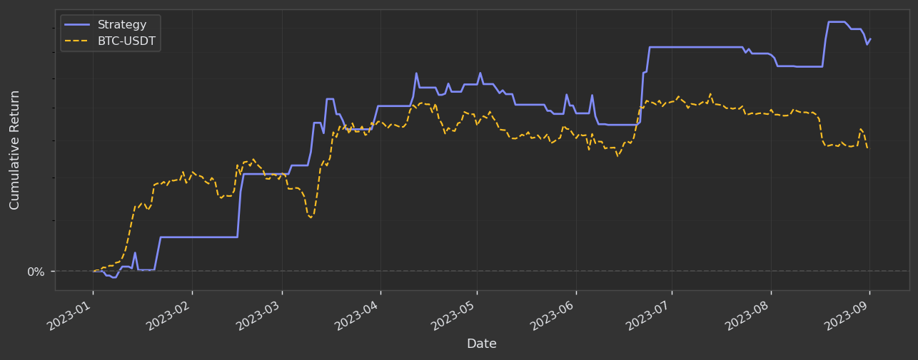
This chart conveys the same information as the one above but with two important differences:
- The Y-axis shows percentage cumulative return instead of absolute dollar balance, making it independent of the starting capital.
- The scale is logarithmic, which means equal vertical distances represent equal percentage moves rather than equal dollar moves.
These two adjustments make the chart more useful when:
- Comparing strategies with different starting balances — normalising to percentage return removes the distortion of different capital sizes.
- Evaluating long backtests — on a linear scale, early percentage gains look tiny compared to later ones simply because the absolute dollar values were smaller. A log scale treats a 50% gain early in the period the same as a 50% gain later, giving a fairer visual picture of consistency.
- Spotting compounding behaviour — a straight line on a log-scaled cumulative return chart means the strategy is compounding at a constant rate, which is the ideal pattern.
Read this chart the same way as the linear version: you want the blue strategy line above the orange benchmark line for as much of the period as possible, with the gap ideally widening over time.
Drawdown — Worst 5 Periods
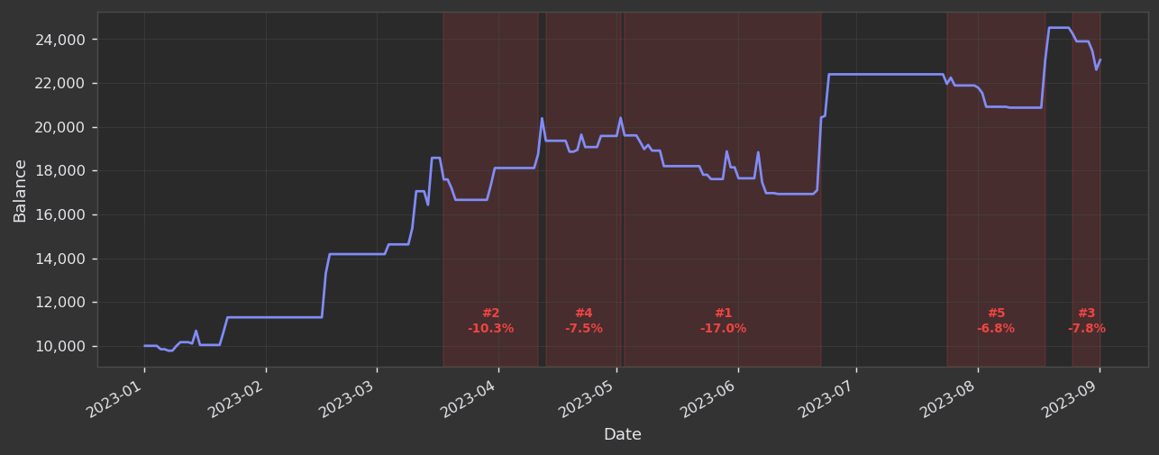
This chart overlays your equity curve with red shaded regions that highlight the five worst drawdown periods in the backtest. Each shaded region is labelled with its rank and the percentage decline from peak to trough.
- Red shaded regions — the duration of each of the five worst drawdowns, spanning from when the equity peaked to when it made a new high (or the backtest ended, if recovery never came).
- Labels (e.g.
#1 -17.0%) — rank by severity and the exact peak-to-trough decline for that period. - Blue equity line — your strategy's balance, giving context for how much capital was at risk during each red region.
In the example above:
| Rank | Approximate Period | Drawdown |
|---|---|---|
| #1 | May–Jun 2023 | −17.0% |
| #2 | Apr 2023 | −10.3% |
| #3 | Sep 2023 | −7.8% |
| #4 | May 2023 | −7.5% |
| #5 | Aug 2023 | −6.8% |
What to look for:
- Width of each shaded region — a narrow region that recovers quickly is far less stressful to endure live than a wide region that drags on for months.
- Drawdown magnitude — ask yourself honestly whether you could hold through a −17% drawdown in real money without intervening. If not, the position sizing or leverage may need to come down.
- Clustering of red regions — if multiple top-5 drawdowns occur in rapid succession (e.g. #2 and #4 both in April–May), it suggests a structural weakness in one particular market regime.
- Drawdown after a strong run — a severe drawdown that occurs immediately after a period of rapid gains can indicate the strategy was over-leveraged into a momentum burst that then reversed.
TIP
Cross-reference this chart with the Interactive Charts view. Click into any red region to see exactly which trades caused the decline and whether the losses were many small trades or a single large one.
Underwater Plot
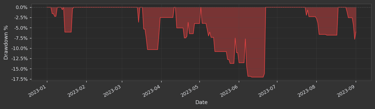
The underwater plot shows how far below its previous equity peak the strategy was at every single point in time. The Y-axis is always ≤ 0%, and the red-filled area represents the "underwater" depth — how deep the strategy is submerged beneath its high-water mark.
Whenever the strategy reaches a new equity high, the line snaps back to 0% — think of 0% as the water surface. Any time the line dips below 0%, the strategy is in a drawdown.
- Depth of dips — how severe each drawdown was at its worst point.
- Width of dips — how long the strategy spent underwater before recovering. Wide troughs mean prolonged periods without new highs, which is psychologically demanding to endure in live trading.
- Frequency of return to 0% — a strategy that regularly touches 0% is consistently making new highs and recovering quickly. A strategy that lingers underwater for the bulk of the chart is spending most of its life losing ground.
In the example above, the strategy spent a significant portion of the mid-period (roughly May–July 2023) at depths between −10% and −17%, with the worst dip reaching approximately −17% in late June. The strategy then recovered and made new highs in July before experiencing shallower drawdowns again in August and September.
TIP
The underwater plot and the Drawdown (Worst 5 Periods) chart are complementary. The worst-5 chart highlights the five specific events; the underwater plot gives you the complete continuous drawdown history so you can see the full texture of the risk profile over time.
Monthly Returns Heatmap
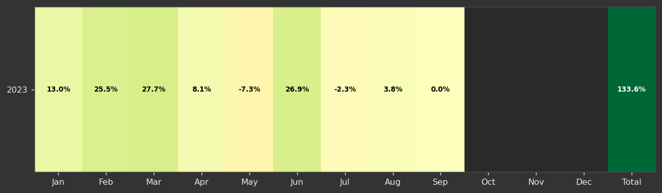
The monthly returns heatmap displays your strategy's return for each calendar month, arranged in a grid with months as columns and years as rows. A Total column on the right shows the compounded annual return for each year.
- Colour intensity — darker green means a stronger positive month; pale yellow indicates a small positive return; red indicates a losing month. The colour scale is consistent across the entire heatmap so you can compare months visually at a glance.
- Percentage labels — the exact return is printed inside each cell so you never have to guess from colour alone.
- Total column — the rightmost cell shows the compounded annual return, coloured by its own magnitude independently of the monthly cells.
In the example above (2023 only), the breakdown is:
| Jan | Feb | Mar | Apr | May | Jun | Jul | Aug | Sep | Total |
|---|---|---|---|---|---|---|---|---|---|
| 13.0% | 25.5% | 27.7% | 8.1% | −7.3% | 26.9% | −2.3% | 3.8% | 0.0% | 133.6% |
What to look for:
- Streaks of green — consecutive profitable months indicate the strategy works across varying market conditions within that stretch.
- Isolated red months — a single bad month among many good ones is much less concerning than a cluster of red. Investigate the red months in the Interactive Charts to understand what happened.
- Seasonality patterns — across multiple years, if the same calendar months repeatedly show red (e.g. August is always a losing month), the strategy may have a seasonal blind spot worth addressing.
- Total column — a strong total with a few losing months is fine. A weak total despite mostly green months suggests the losing months were disproportionately severe — check the heatmap alongside the drawdown charts.
Monthly Returns Distribution
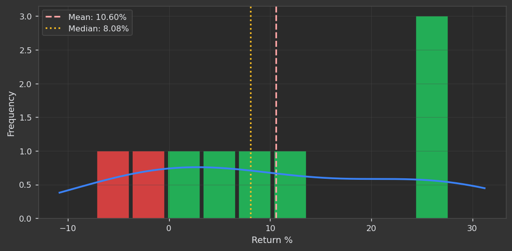
This histogram shows the frequency distribution of monthly returns across the entire backtest. Each bar represents a range of return values, coloured green for profitable months and red for losing months. The blue smooth curve is a kernel density estimate (KDE) — a smoothed approximation of the underlying distribution.
- Green bars — months where the strategy was profitable.
- Red bars — months where the strategy lost money.
- Dashed red line — the mean monthly return.
- Dotted orange line — the median monthly return.
- Blue KDE curve — the smoothed probability density of monthly returns, giving a cleaner shape of the distribution independent of bin-width choices.
In the example above, the mean is 10.60% and the median is 8.08%. The mean being higher than the median means the distribution is slightly right-skewed — a few exceptionally strong months are pulling the average up. This is a desirable property: it means the strategy's upside outliers are larger than its downside outliers.
What to look for:
- Mean > median (right skew) — large wins are more extreme than large losses, which is healthy.
- Mean < median (left skew) — a few very bad months are dragging the average down, even if most months are fine. This warrants a closer look at the worst months.
- Narrow distribution — most returns are clustered near the mean, indicating consistency. A very wide spread means the strategy's month-to-month outcome is highly variable.
- Proportion of red vs green bars — ideally the bulk of the frequency mass sits in the green region, with the red bars both less frequent and representing smaller magnitudes.
Trade PnL Distribution
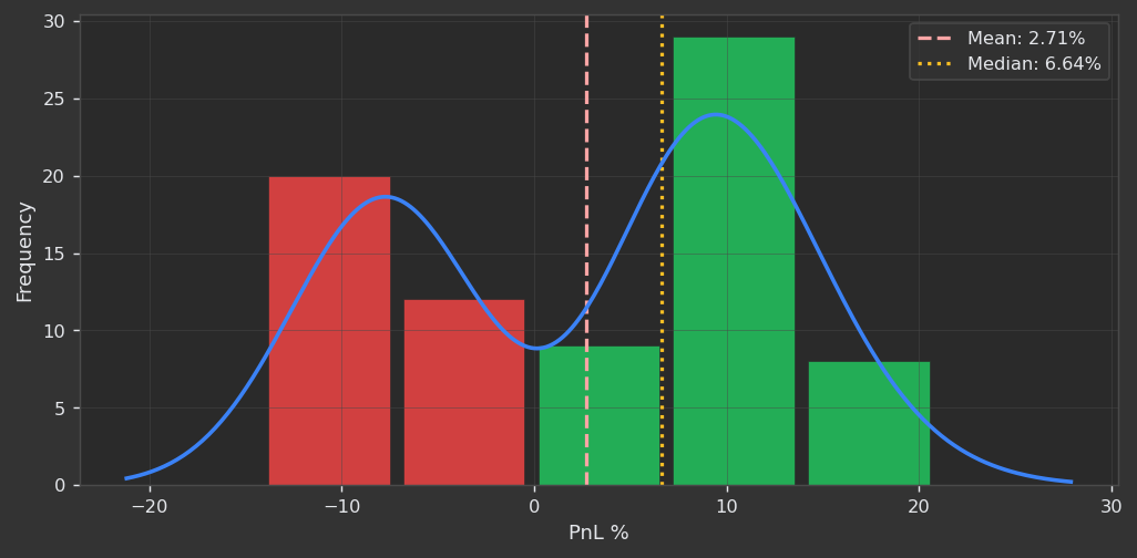
This histogram shows the frequency distribution of individual trade P&L percentages across the entire backtest. Like the monthly returns distribution, bars are coloured green for winning trades and red for losing trades, with a KDE curve overlaid.
- Green bars — winning trades and their magnitude.
- Red bars — losing trades and their magnitude.
- Dashed red line — the mean trade P&L.
- Dotted orange line — the median trade P&L.
- Blue KDE curve — the smoothed distribution shape.
In the example above, the mean trade P&L is 2.71% and the median is 6.64%. Here the median is notably higher than the mean, which signals that a subset of losing trades are unusually large — they pull the arithmetic average well below the typical (median) outcome. Looking at the histogram confirms this: losses cluster in the −10% to −5% range while wins are concentrated around +5% to +10%.
What to look for:
- Median significantly above mean — some trades are large outlier losers. Check whether these correspond to specific market conditions, a missing stop-loss, or trades held through overnight gaps.
- Wide loss tail — if the red bars extend far to the left with high frequency, the maximum loss per trade is not being controlled tightly enough.
- Win magnitude vs loss magnitude — even a strategy with a sub-50% win rate can be highly profitable if the green bars are centred well to the right of the red bars. The ratio of the average win to the average loss (reward-to-risk) is the key number here.
- Thin right tail of wins — if the bulk of wins are small and there are no large outlier winners, the strategy may lack a mechanism to let profitable trades run. Combined with the equity curve, this can explain a flat or slow-growing balance.
TIP
The trade P&L distribution and the monthly returns distribution tell different stories. Monthly returns reflect how profits and losses are spread across time; trade P&L reflects how they are spread across individual trade decisions. A strategy with strong monthly returns but a wide, left-skewed trade P&L distribution may be relying on a small number of outsized winning trades — which works until it doesn't. Aim for both distributions to be right-skewed and reasonably concentrated.